315 million people are blind or low-vision, and most QR scanning apps fail them. Here's how to make your QR codes actually accessible, with real solutions.
Quick question, and be honest with yourself: when you made your last QR code, did you think even once about whether a blind person could use it?
Most people don't. It's not malice, it's just that a QR code feels like a purely visual object a little square pattern, point your camera, done. Except that's exactly the problem. There are roughly 315 million people worldwide who are blind or have low vision, and for a huge share of them, that "simple" chain of point-scan-done breaks before it even starts.
The numbers are worse than you'd guess
Here's what recent accessibility research has actually found, and it's worth sitting with each figure rather than skimming past it:
- Only about 15% of visually impaired users can successfully scan a QR code without help from someone else. Not "find it a bit annoying" can't do it, full stop, without a sighted person's assistance.
- Roughly 90% of QR code scanning apps don't support screen readers. So even when someone manages to scan the code, the app itself often can't speak the result aloud which means even a perfectly designed destination page becomes useless if the tool getting them there is silent.
- About 30% of QR codes are effectively inaccessible to people with color blindness, usually because of low-contrast color choices that seemed fine to whoever designed the packaging or poster.
- 15% of visually impaired users specifically cite poor contrast as the thing standing between them and actually using the code at all.
Put those together and you get a genuinely uncomfortable picture: a technology that's become the default way to hand someone a menu, a payment link, or product information has, for a meaningful chunk of the population, quietly become a wall instead of a door.
Why this happens and it's not the technology's fault
None of this is really about QR codes being inherently bad for accessibility. It's about design choices made without accessibility in mind. A code that's technically scannable but printed in light grey on white, or shrunk down into a corner with no label, or placed somewhere a cane user would never think to point a phone camera that's not a limitation of the QR format itself. It's a decision, usually made by someone who never had a reason to think about it.
Even the app layer, where most of the actual failure happens, comes down to the same root cause. A screen reader like VoiceOver or TalkBack needs an app to properly label its buttons and results for it to have anything to say out loud. If a scanning app's developer built a clean-looking interface without testing it against a screen reader even once, the app can work flawlessly for a sighted user and be a dead end for someone who isn't through no fault of the underlying QR technology at all.
What's actually being built to fix it
The good news is this isn't an unsolved problem there's real, working technology addressing each layer of the failure, and some of it has already made it onto shelves.
Finding the code in the first place is often the first barrier, well before scanning even comes into it a standard QR code is small, low-contrast by default, and easy to miss entirely if you can't see it. QR Braille, developed at Chulalongkorn University, solves this with raised beads arranged around the code's border, so a fingertip can locate and confirm it before a phone ever comes out. NaviLens takes a different approach a visually distinct, color-blocked code, larger and higher-contrast than a standard QR, that a free companion app can detect from meters away without needing precise alignment. It's already been piloted by brands including Kellogg's and Coca-Cola UK on product packaging, and used for wayfinding in transit settings, including subway stations on the New York City metro.
Getting useful information once it's scanned is the second half of the problem, and it's where companies like Zapvision have focused their Accessible QR (AQR) format adds a small pattern of dots and dashes around one corner of a standard-looking code, letting a compatible app detect it from a distance and then read out structured product information via text-to-speech. Persil rolled this out across UK packaging, and Bayer Consumer Health has used the same approach in healthcare packaging genuinely practical deployments, not just lab demos.
What this actually means if you're the one making the QR code
Here's where this stops being abstract and starts being something you can actually act on, whether you're printing a restaurant menu, a product label, or an event flyer:
- Contrast is the single cheapest fix available. A QR code doesn't need to be black on white specifically, but it does need strong contrast between the code and its background avoid pastel-on-pastel or light-grey-on-white combinations that might look elegant on a mockup and become genuinely unreadable for anyone with reduced contrast sensitivity.
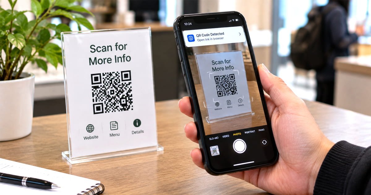
- Never rely on the code alone to communicate what it does. Printing plain text next to it "scan for the full menu," "scan for ingredient and allergen information" means a sighted companion, a store employee, or a screen reader reading the surrounding page can still convey the purpose even if the code itself can't be scanned in that moment.
- Size and placement matter more than most people think. A code shrunk into a corner to save space is harder for everyone, not just low-vision users, to locate and hold steady long enough for a phone camera to lock onto it.
- Test where the code actually leads, not just the code itself. A perfectly accessible QR code pointing at an image-only PDF or an unlabeled web page has just moved the failure one step down the chain rather than fixing it. If you're using a dynamic QR code, it's worth actually opening the destination with a screen reader active at least once before printing a thousand copies of the code that leads there.
- When accessibility genuinely matters for your use case packaging, public signage, healthcare information the tools above (QR Braille, NaviLens, Zapvision) are worth researching specifically, rather than assuming a standard QR code is doing the job just because it scans fine for you.
The bit worth remembering
A QR code's entire value proposition is that it removes a barrier no typing a long URL, no searching for a product manually, just point and go. For the 315 million people who are blind or have low vision, a badly designed one does the opposite: it adds a barrier exactly where the technology promised to remove one. None of the fixes here are exotic or expensive. Most of it comes down to contrast, labeling, and actually checking where the code leads habits any of us generating a QR code today could start practicing on the very next one we make.